Tips to a Strong Vehicle Wrap Design
Tips and advice when it comes to designing the perfect vehicle wrap for your buisness.
MORRISVILLE, PA, US, March 9, 2020 /EINPresswire.com/ -- So you’re looking at getting your vehicle wrapped. You found a company to do it but now they are asking you about what you want for the design. Most people aren’t designers, so where do you even begin in explaining what design you had in mind? Here are some tips to help you wrap your head around your vehicle wrap’s look.
The first piece of advice that must be given is to not rush into a design. You may be excited to just get to the end of the process and finally see the wrap. If you rush just to get to the finished product, you may find that you don’t actually like the design you approved of after all. Then you have to wait even longer and spend even more money to backtrack and get it right. Avoid having to try again at all, and spend time on the design now. It will be worth the wait. So how do you even get started with the design?
The goal of any wrap is to advertise a brand. If you are wrapping a company vehicle then what the business is will be what’s advertised. If this is more of a personal project, then you are the brand and your style is what is being advertised. So when thinking about the design you want to make sure that it doesn’t lose sight of the goal - to state your brand to your target market or audience. Ask yourself what is my brand? That will guide the rest of your design choices.
A great place to get inspiration is to scope out the competition. What designs do others with a similar brand have? This will not only help you get ideas in general but also hint on how you can stand above the rest. You don’t want to resemble what others have done too closely, or people might mistake you for them! By taking a look at others you can also get an idea of what works or doesn’t work in their designs. This way you can avoid mistakes and enhance upon what you know already works.
So now that you know your brand and have some inspiration its time to take it a step further and think about your design itself. A general rule to follow regardless of what will be incorporated into the wrap’s design is to not overcrowd it. Wraps need to be easy to look at and quick to understand while staying visually interesting. From there you have to consider the elements being used in your wrap design: text, color, and graphics.
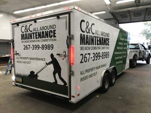
Text is vital especially for commercial wraps because you want to make sure your company’s name is incorporated into the wrap. When choosing a font its important to pick one that is easy to read but doesn’t look unprofessional. In general bold letting works best overall. You want to be careful with any script-like fonts because while they make look nice they can also be hard to read. Any graphic designer will tell you to also avoid fonts like comic sans, papyrus and other overused fonts. These fonts are not considered professional and may give off the notion that you don’t know what you're doing.
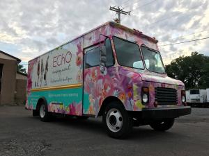
Color is useful for making your wrap visually attractive so it garners the attention your want and to set the tone of what you or your business is about. White and black are good colors to utilize because they are more neutral. It can either accent your main colors, be a good contrast or be used for blank space. Warm colors: red, orange and yellow, are colors that attract the eye to it and give off energy. Cool colors: green, blue and purple, are calming colors and are easy on the eye. Consider what colors mean and what it can say about your brand. Be careful not to pick clashing colors. For example, dark blue and black or yellow and white are hard colors to see next to each other. Other clashing colors include brown/black, red/green and red/orange. You also want to keep your color choices limited, stick to just a few strong choices rather than the whole spectrum.
If you’re using graphics or imagery in your wrap you want to make sure its relevant to your brand. If, for example, you make wedding cakes - you don’t want imagery of tigers and swords. It won’t translate to potential customers about what your business is about. While it’s important for the graphics to look good it still has to relate to your brand. As mentioned before, you also want to be careful how much imagery your using - you don’t want your design to be so busy that viewers are confused or, even worse, don’t want to look at your wrap.
The last tip that can be given may be one of the most important of all. You designed your wrap and its perfect! The design has eye-catching colors, clear text, and relevant imagery - all that’s left is to install it on to your vehicle. You get it installed but you didn’t look into if the company was actually good at vehicle wraps. You finally get your vehicle wrap back and despite such a strong design, it doesn’t look good because the installation wasn’t done properly. Before you get any vehicle wrapping done make sure you pick a company that is going to do it right. Your design deserves to be finished with the same amount of care you put into creating it. Do your research on the company before you hand over your time and money. A great company will work hard for your investment.
Slicks Digital
Slicks Graphics Inc.
+1 2157368000
email us here
Legal Disclaimer:
EIN Presswire provides this news content "as is" without warranty of any kind. We do not accept any responsibility or liability for the accuracy, content, images, videos, licenses, completeness, legality, or reliability of the information contained in this article. If you have any complaints or copyright issues related to this article, kindly contact the author above.


