14 Design Tips That Can Help Your Brand Stand Out
Award-winning Graphic Designer/Art Director Shares Secrets to Successful Graphic Branding
According to Robin Hercia, owner of AWMYL Design Studio, “The recent wave of digital advertising has made consumers more skeptical than ever when it comes to marketing techniques. Creating a website isn’t enough to build brand awareness; you also need compelling graphic design that helps your marketing messages stand out.”
Hercia specifies three areas where graphic design can have a significant impact on a business’ branding: the website, logo and printed materials:
Graphic Design Techniques for Logos:
Your logo is one of your business’s most important branding tools. It gives potential customers an easy way to associate marketing materials, products and other assets with your company. As such, you should invest plenty of time and thought into developing your logo, or hire an experienced graphic designer to create it.
Here are four tips to take your logo design to the next level:
Create a logo that tells a story. What are your business’s unique sales points? What are your company’s values? A logo that has both hidden and obvious meanings will demonstrate intelligence and attention to detail.
Keep it simple. This will help your audience remember your logo.
Be unique. Is it likely that other businesses have used the logo? Or that other companies might use the same logo in the future? Sometimes all it takes is a simple yet clever use of lines, color or font to make a generic logo iconic.
Use a double entendre. Combining two images into one is an easy yet effective way to add a clever twist to your logo and expand its meaning.
Techniques for Websites:
A compelling website should have the perfect balance of function and aesthetic appeal. In addition to offering user-friendly navigation, fast load times and concise, grammatically correct writing, your site should engage visitors with the proper use of fonts, colors, layout and images.
Here are seven tips to help you create a captivating webpage:
Limit the number of fonts you use.
Keep your font choices consistent throughout the website.
Don’t put words and elements too close together.
Limit your hues to one to three primary colors and one to three secondary colors. You can add variation by adjusting the tone and brightness.
Make sure your elements align to guide visitors’ eyes to important elements on the page.
Use the same layout on multiple pages to help users navigate.
Choose your website’s colors based on the hues in the logo and other marketing materials. This is an essential technique in building brand awareness.
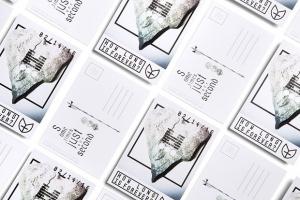
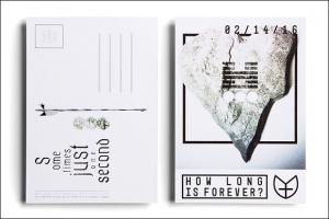
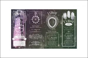
Thanks to the proliferation of the Internet and social networks, marketers have begun to shift their focus away from print ads and toward digital media. This approach offers a multitude of benefits: no print costs, no distribution costs and the potential to share your brand with millions of Web users. However, print materials can still play an important role in your business’s branding and marketing efforts – especially when they incorporate clever and meaningful graphic design. Here are a few tips for creating engaging printed materials:
Limit the number of words and images on the page. Too much content can make it difficult for your audience to comprehend your message.
Use inversion. There are countless ways to make a particular word or phrase stand out, but inversion is a timeless graphic design technique that can give text more impact. This involves the exchange of font and background colors – for example, using white font over a black background when most of the content consists of black font over white background.
Use high-resolution images. A low-quality photo will make your company appear inattentive to detail and your brand outdated.
Whether you are launching a new business or updating your company’s marketing strategy, the clever use of graphic design can take your branding efforts to the next level. With these 14 tips, your digital and printed content will engage your audience while effectively communicating your business’s message and sales points.
Paul Gendreau
PGPR
678-807-7945
email us here
Legal Disclaimer:
EIN Presswire provides this news content "as is" without warranty of any kind. We do not accept any responsibility or liability for the accuracy, content, images, videos, licenses, completeness, legality, or reliability of the information contained in this article. If you have any complaints or copyright issues related to this article, kindly contact the author above.


